Restoration
1964 Milwaukee Braves Eddie Mathews
I have SO MANY of these to share and only limited time to collect the photos and write them up. For those of you in the “uniform obsessed” group, I though you would like to see this deep dive on a high-dollar restoration.
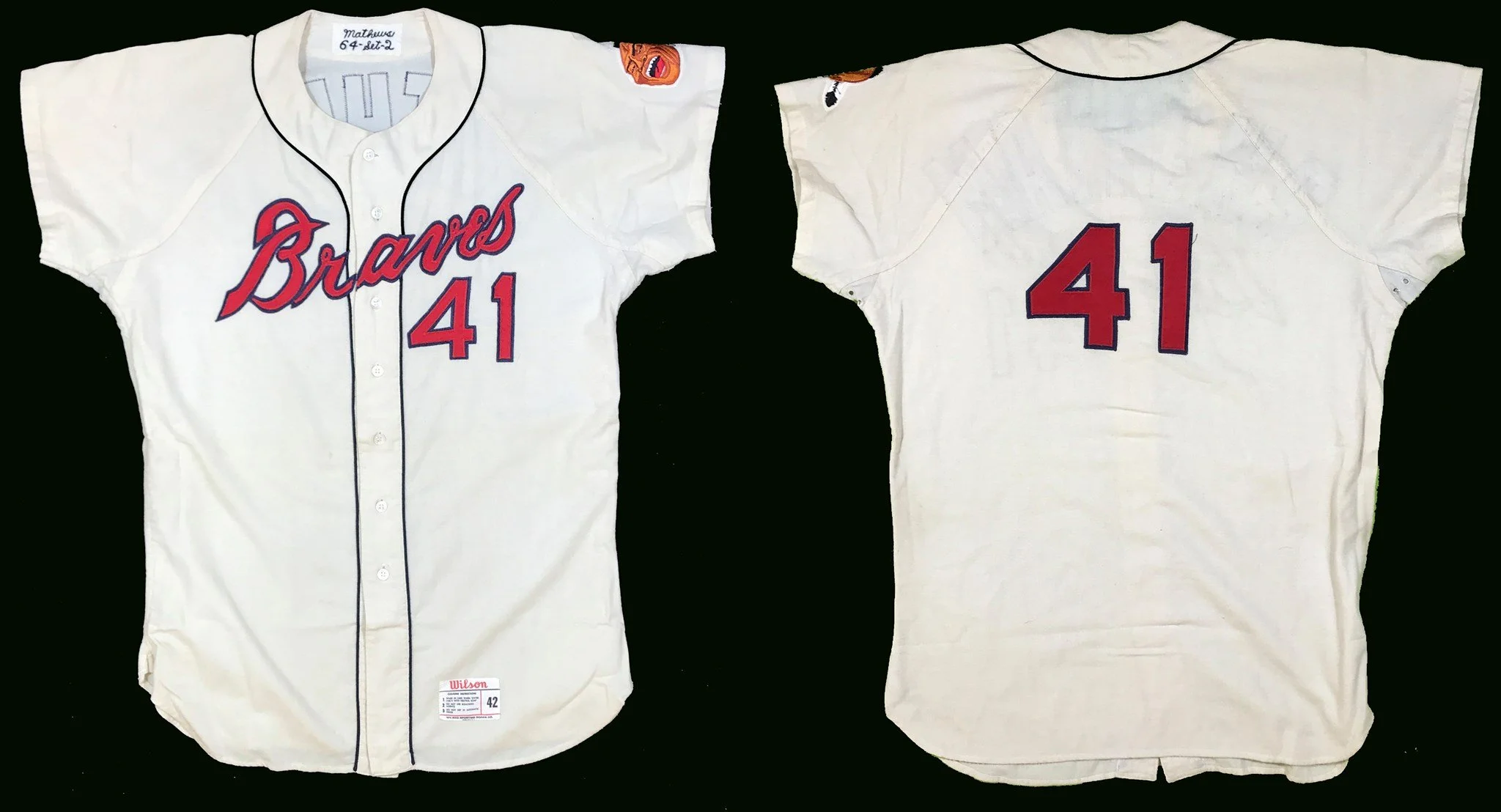
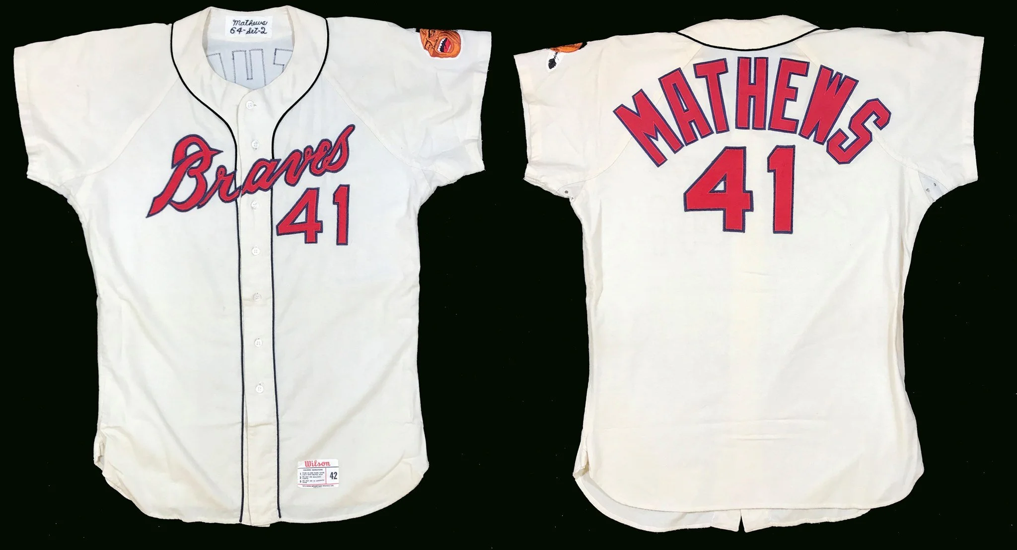
I am always honored when royalty visits the Dream Shop. Today we have been entrusted with the restoration of Milwaukee Braves’ Eddie Mathews 1964 home jersey, as fine a piece as you will ever see. It belongs to a collector who wishes to remain anonymous, yet who graciously has allowed me to share this project with you. He proudly owns jerseys of all ten “retired-numbers” Braves players. No expense was spared in this museum quality restoration which took me the better part of two days.
Follow along with the story in the photos that follow.

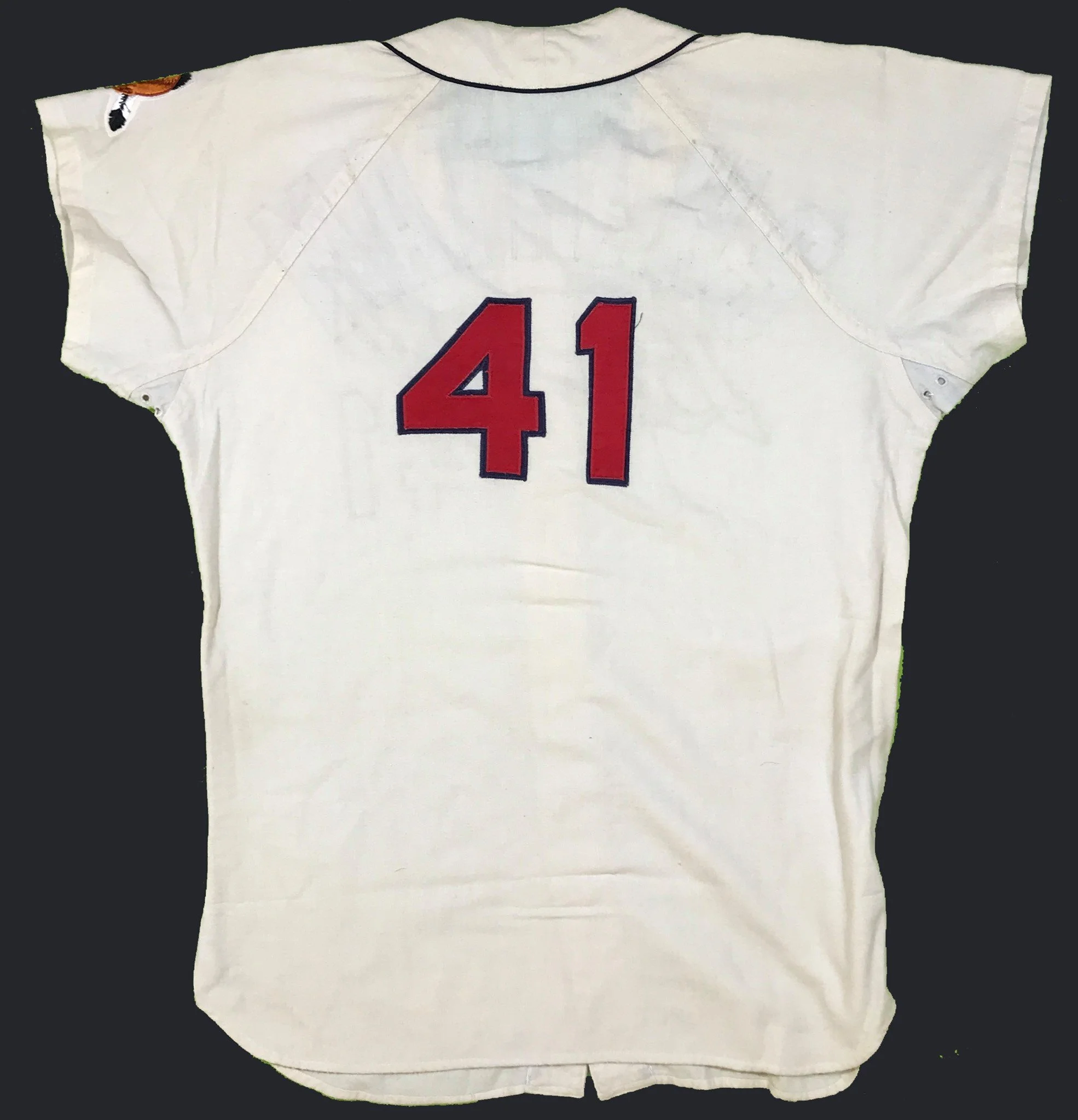
As received, the jersey was in very good condition, but had been stripped of the player name on back. Why? Well, as a rule, back in those days, at the end of the season jerseys for most teams, all the uniforms were gathered up and unceremoniously stripped of their player names to prepare them to be sent to the minor leagues for another few seasons of hard use. After careful examination, my conclusion is that “someone” saved this particular relic from such a painful process of destruction, and pulled it from circulation. It has been lovingly kept in this unrestored condition the past 55 years.
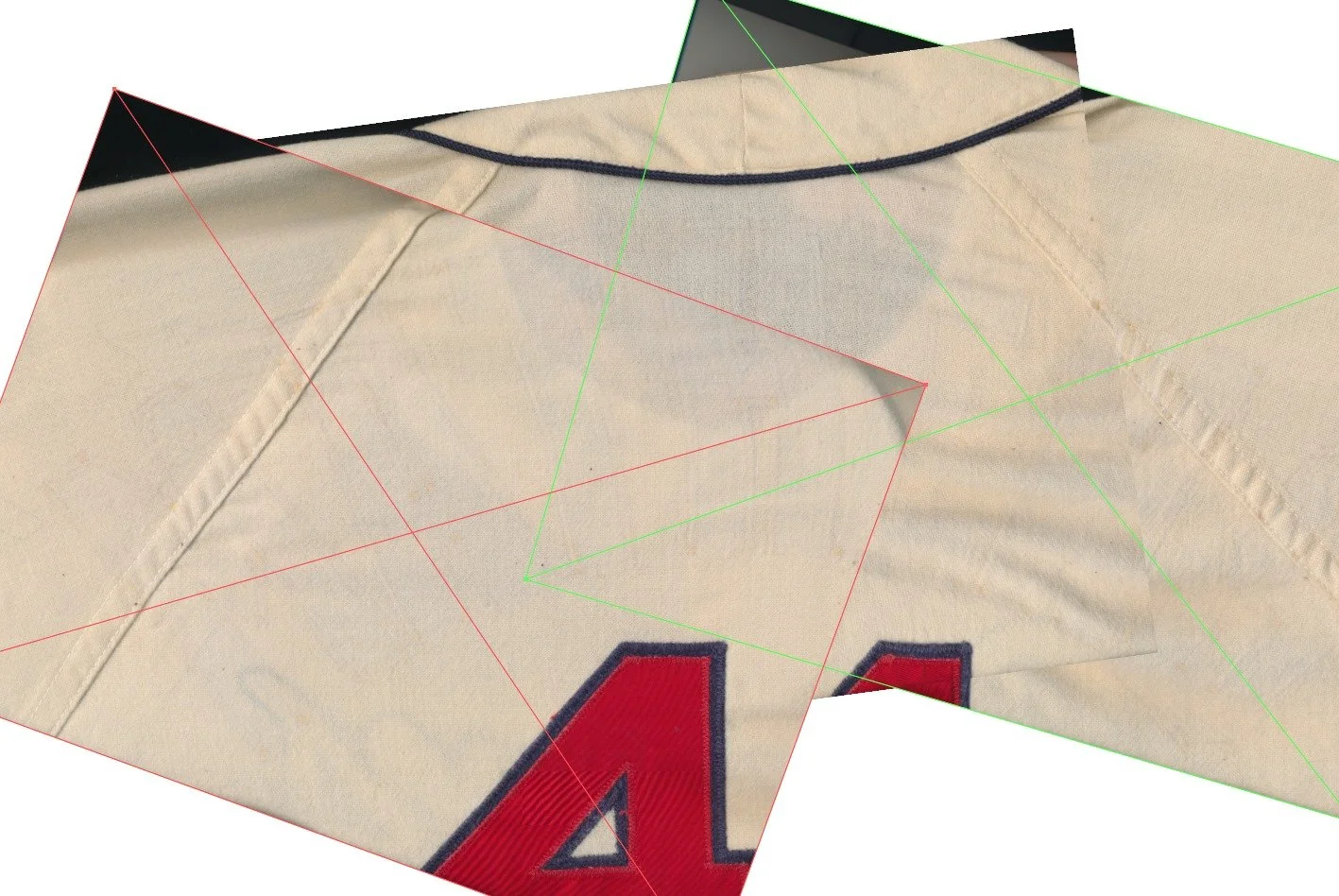
The first thing I do is put the jersey on the flatbed scanner and scan it in high resolution. This does two things for me. First, I can zoom in and see every tiny detail of where the old stitching was removed. Sewing fabric compresses the weave of the cloth very slightly where the thread enters and exits. Secondly, a scan like this is PERFECTLY 100% of original size when imported to my vector graphics application, Adobe Illustrator. There will be no guesswork in determining the actual original size.
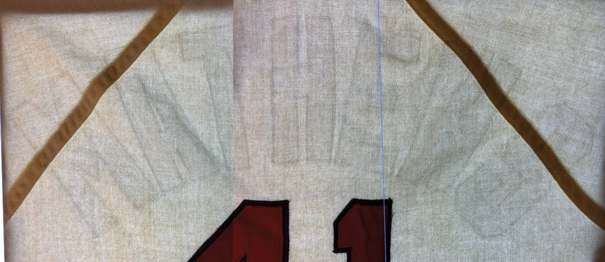
Next, I take high resolution photos of the jersey placed on the light table, and overlay the scanner’s images to match its 100% size. The shadows we can see are from the microscopic weave compression that remains from that stitching done 55 years ago. Even repeated washing does not completely erase these artifacts. These ghosts are a starting point to allow us to make a perfect replication of the removed lettering.
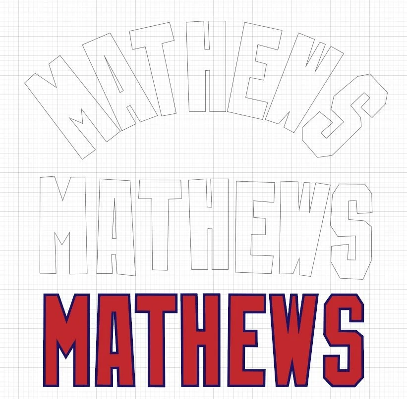
Here is the process of creating the pattern for the lettering. The top, arched example is a direct trace of the lettering from the scan. The middle example shows the letters arranged into a drunken line. The distortion that is so visible here is from the fact that the fabric is pliable and easily distorted. It will never do to cut lettering that looks like this! The bottom example is the lettering, cleaned up with all artifacts removed. Even though this font was clearly created by a draftsman on a drafting table, we can assume that he followed basic rules of design, keeping strokes the same width; angles and outlines consistent. But it still does not tell us all we need to know; outline widths for example.
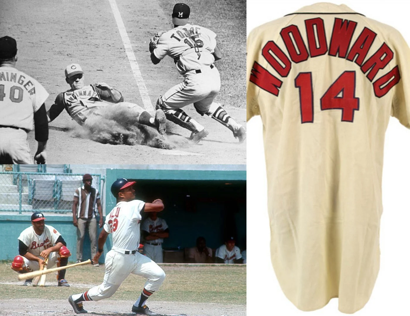
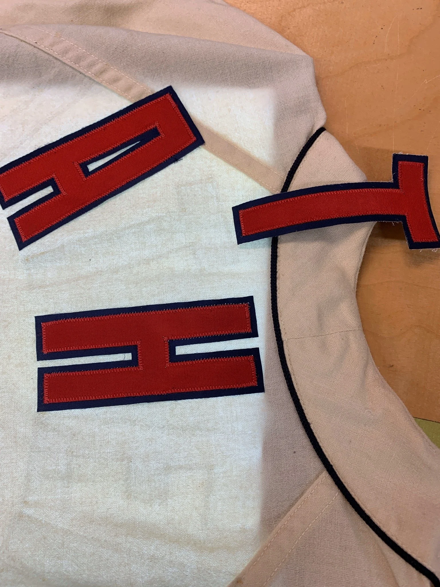
Available photographs of the odd Braves NOB lettering are surprisingly scarce to the researcher. Most auction jerseys have had their NOBs badly replaced. And press photos from smaller market teams are hard to find. In my years of research, I find that most available photos of smaller market teams are taken when they are ON THE ROAD and visiting New York, Detroit, St. Louis or Boston. Here are a couple of photos I was able to scrounge up, and they help me confirm lettering shapes as well as the width of the blue outline that is not evident from the shadows on the stripped garment. These photos allow me to fine tune my alphabet.
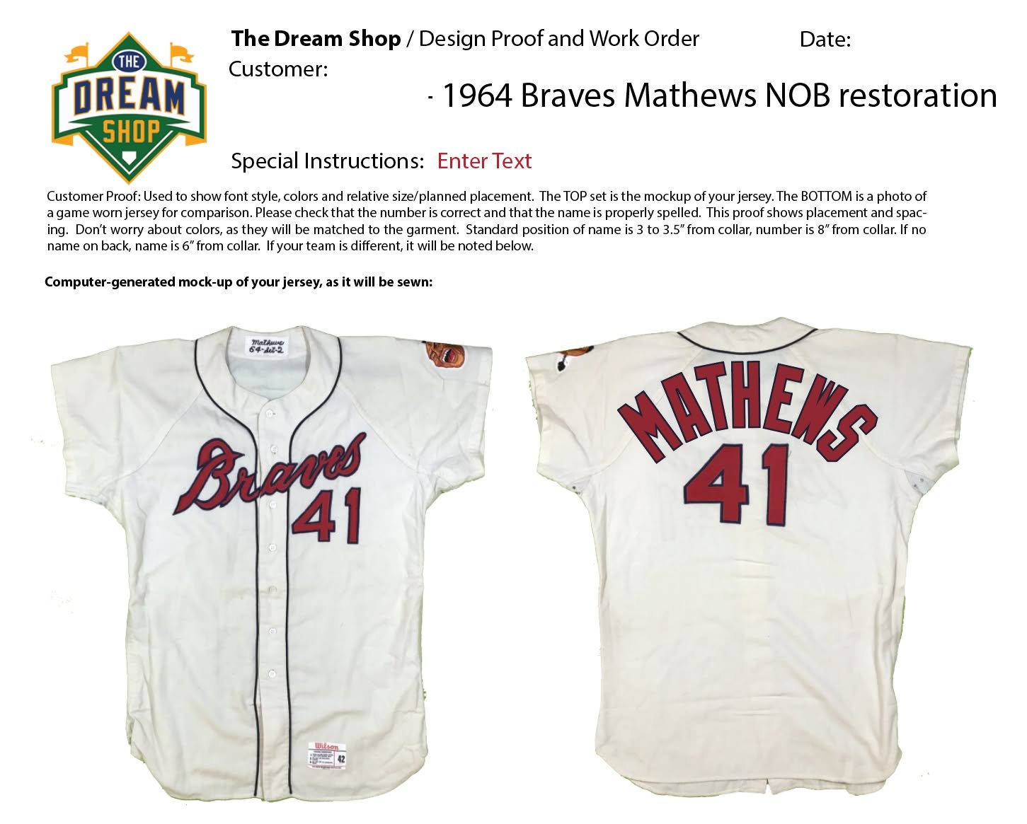
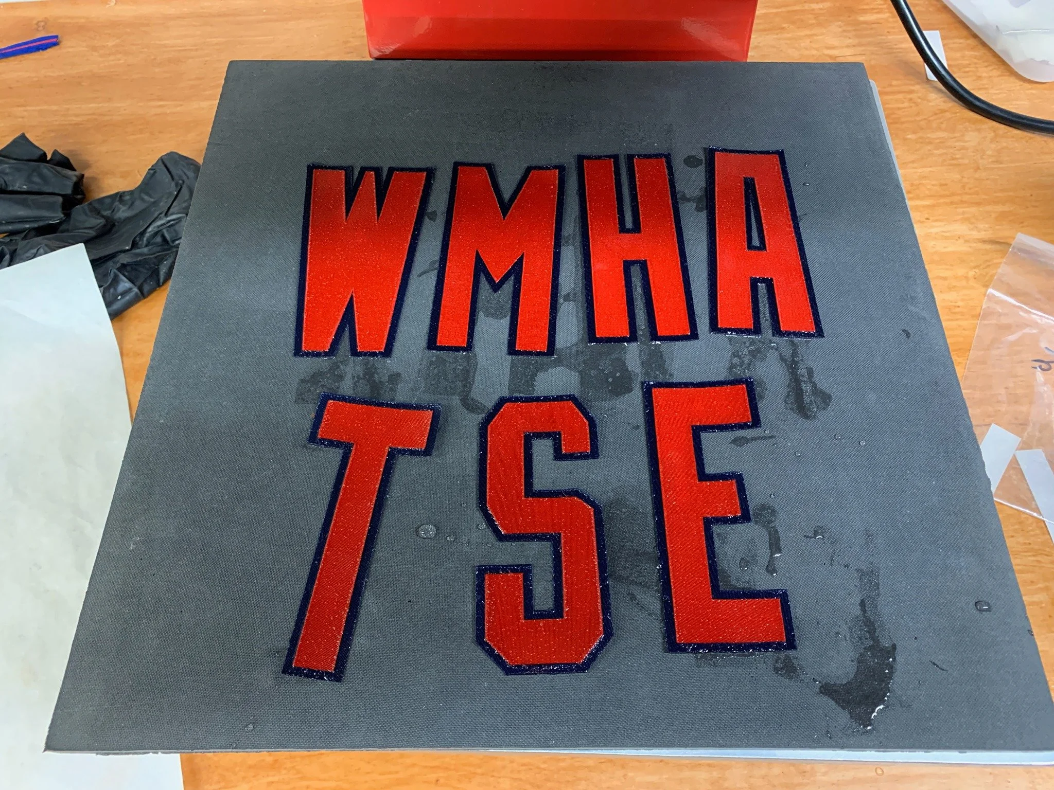
Here is the proof, sent to the collector for his approval. This essential step is a key part of my quality process, and it is never skipped.
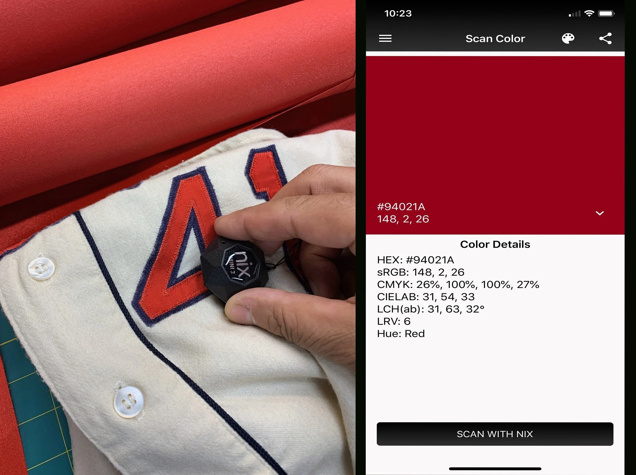
If you are a real geek— this part will light your fire, Here I am using a special tool called a NIX color sensor. It pairs with my iPhone and scans colors, giving me a detailed numeric analysis of the blend of magenta, cyan and process yellow in every swatch. (yes, there are hints of blue and yellow in the color “red”) Here, you can see its numeric evaluation of the red in the original lettering.
Next, I scan my closest-matching fabrics. The bottom scan on each set of three is from the jersey’s lettering. The top two scans are of the tackle twill I plan to use. Why are there two? Well, as we have shown before here, tackle twill is color-shifting in the light. When the fabric is rotated 90 degrees, it looks like a slightly different color to the eye. The top two scans in both the red and blue are of the same fabrics, but at zero degrees and 90 degrees of physical rotation. By the way, this is the end result of a much longer process where I test fabric of slightly different colors from different dye lots. These were just the closest matches.
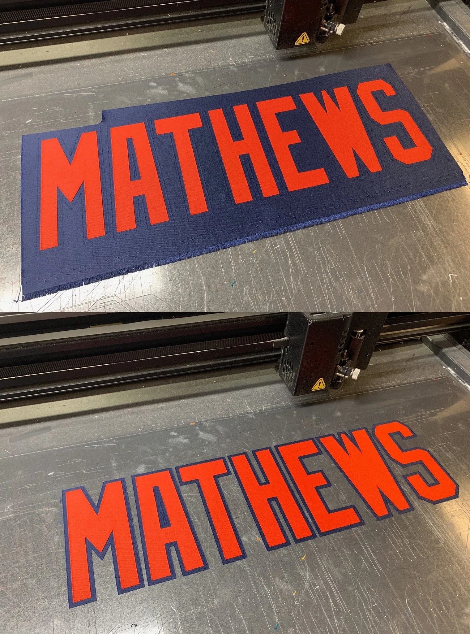
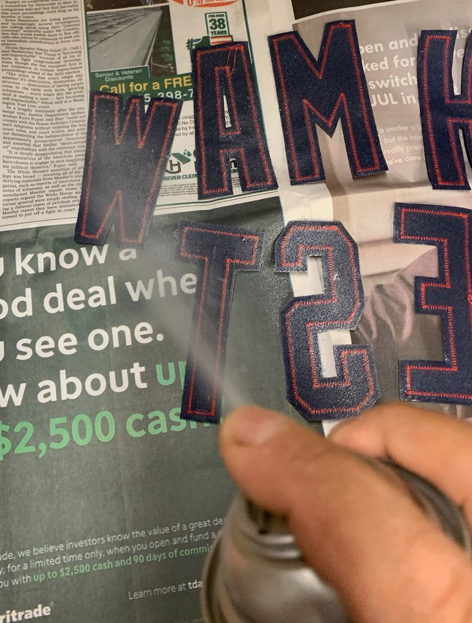
Next, I cut the lettering on the Ioline cutter. Both colors are cut in one pass for perfect alignment.
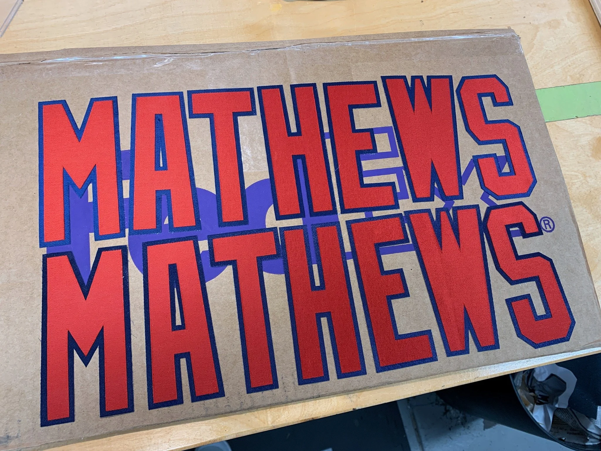
Why are there two? One of these is 5% larger than the other. I will boil both in distilled water and then steam them aggressively to dry them, causing them to pucker and shrink to simulate 50 years of use. I can’t be sure which set will be the “right” size when this process is complete, so I make two sets. The lettering is shown tacked to a piece of corrugated cardboard so I can media blast it to dull the sheen to match the appearance of the original, aged lettering. I know I’ve strafed it long enough when the purple “FedEx” logo printed on the box lid starts to disappear!
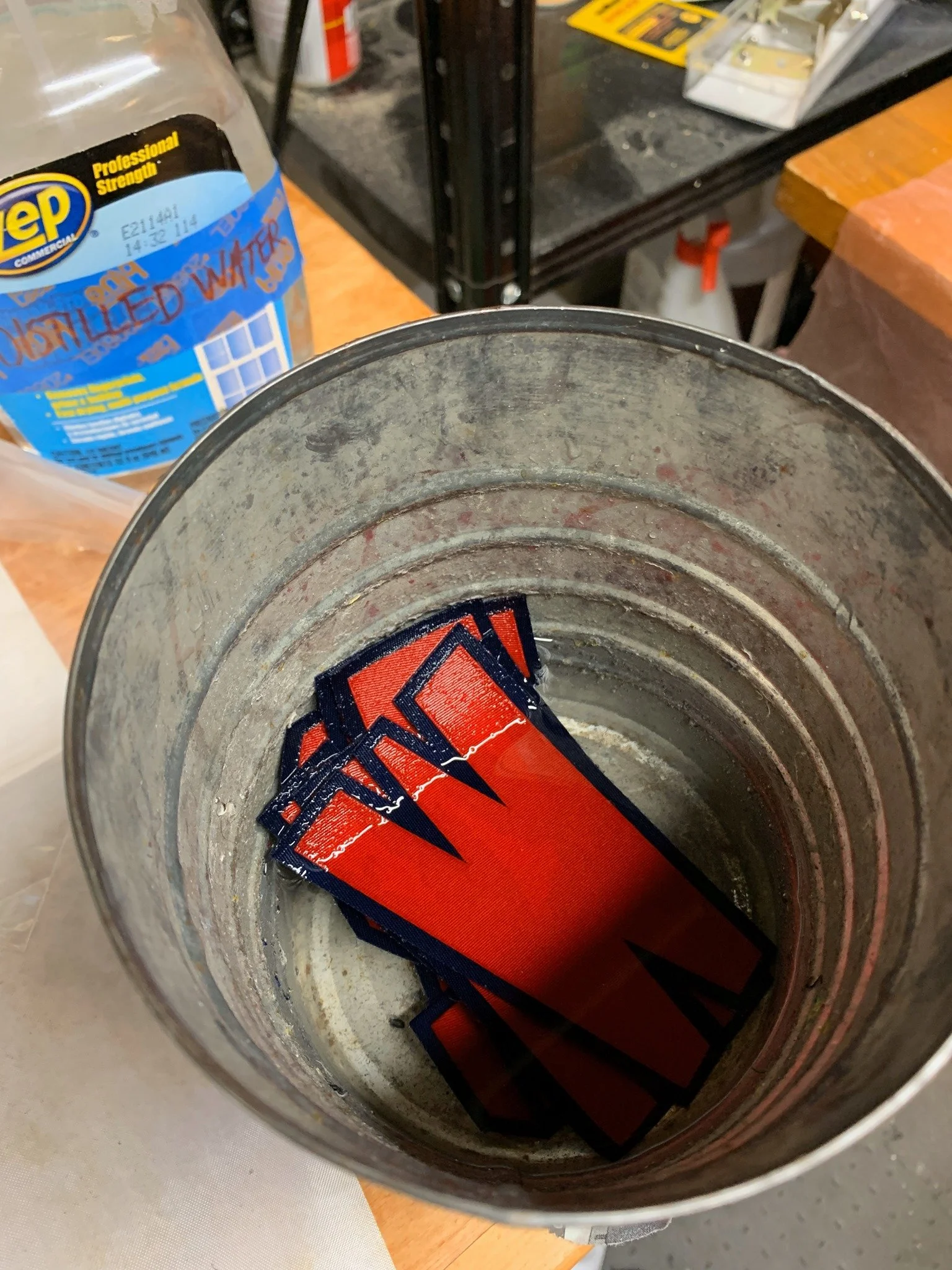
I soak the media-blasted lettering in water…
Then I steam it aggressively at 330 degrees, creating clouds of hissing vapor. The result of all this abuse creates lettering that closely matches the old in terms of texture, pucker, softness of edges, and color. (this is wet, "pre-steamed")
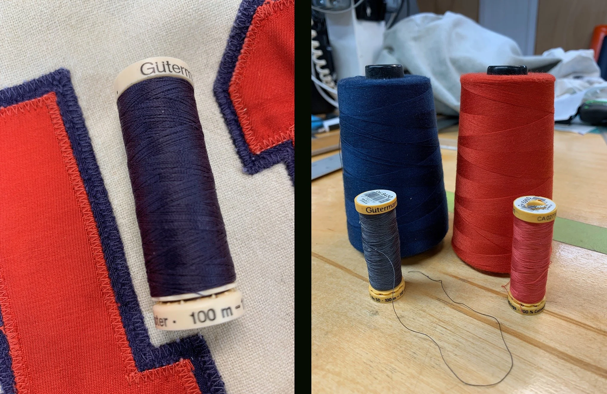
Thread matching is an important next step. Usually made with a cotton blend, the thread used to hold the lettering generally has faded even more than the lettering itself. I keep a selection of “bleached color” threads to match the aged originals. My Navy blue thread is actually a shade of violet; the red is a shade of rose.
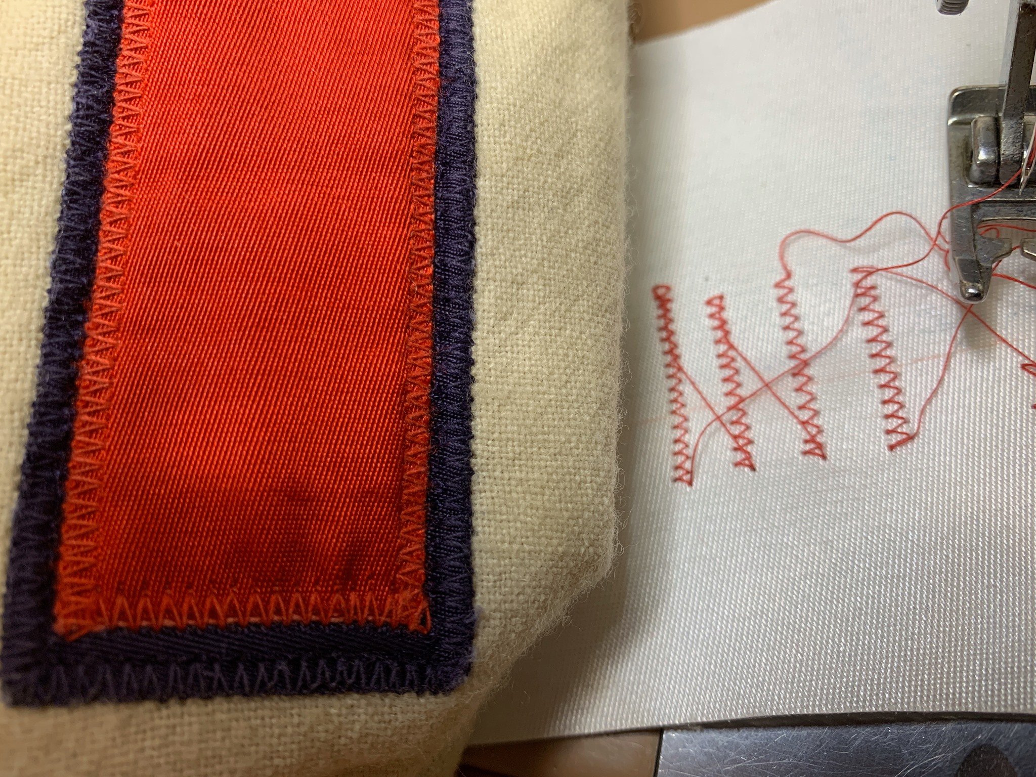
I carefully test to match the size and frequency of my stitching to the original tailor’s.
I lightly spray the backs of the letters with a tacking adhesive so they will stay put for stitching once I have laid them in place.
The placement of the new lettering is done on the light table. My goal is to exactly cover the original shadows so that zero evidence remains of the letters having gone missing.
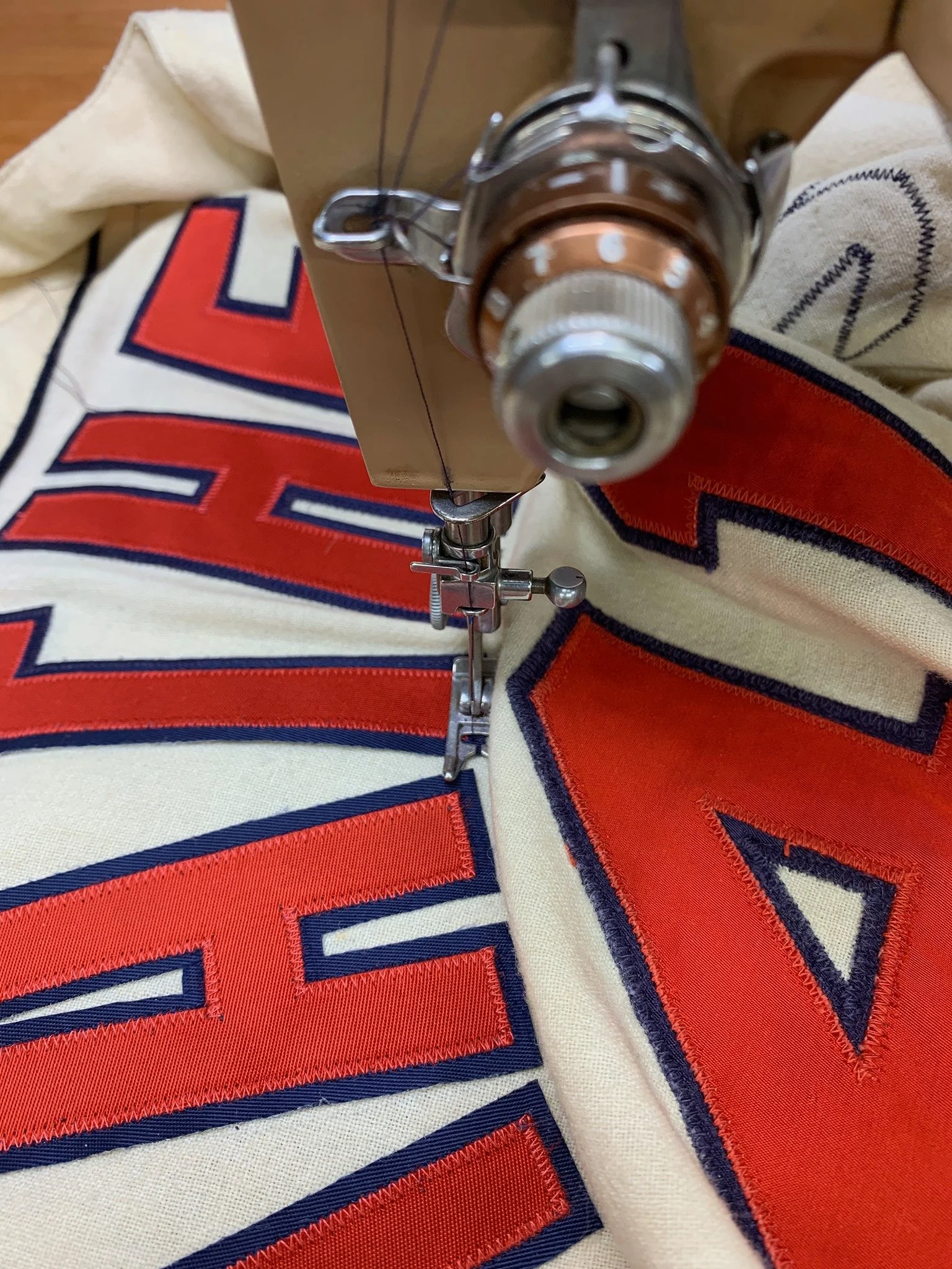
Here, the lettering being stitched in place on my 1957 vintage Singer Slant-o-Matic sewing machine.
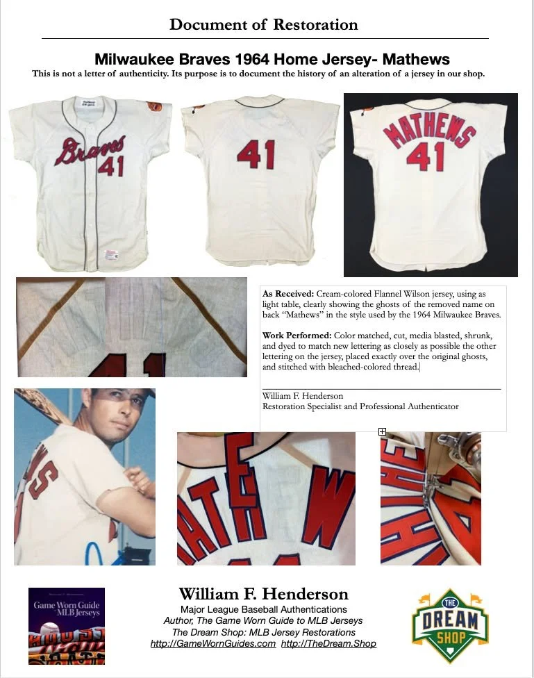
I always, always, always recommend that anyone having a jersey restored by me also should get a Document of Restoration, describing and picturing the process. Why? It cements the knowledge that this jersey was restored to original condition, and not fraudulently modified to fool someone. This simple document can add thousands of dollars to the value of an item at auction in the future.
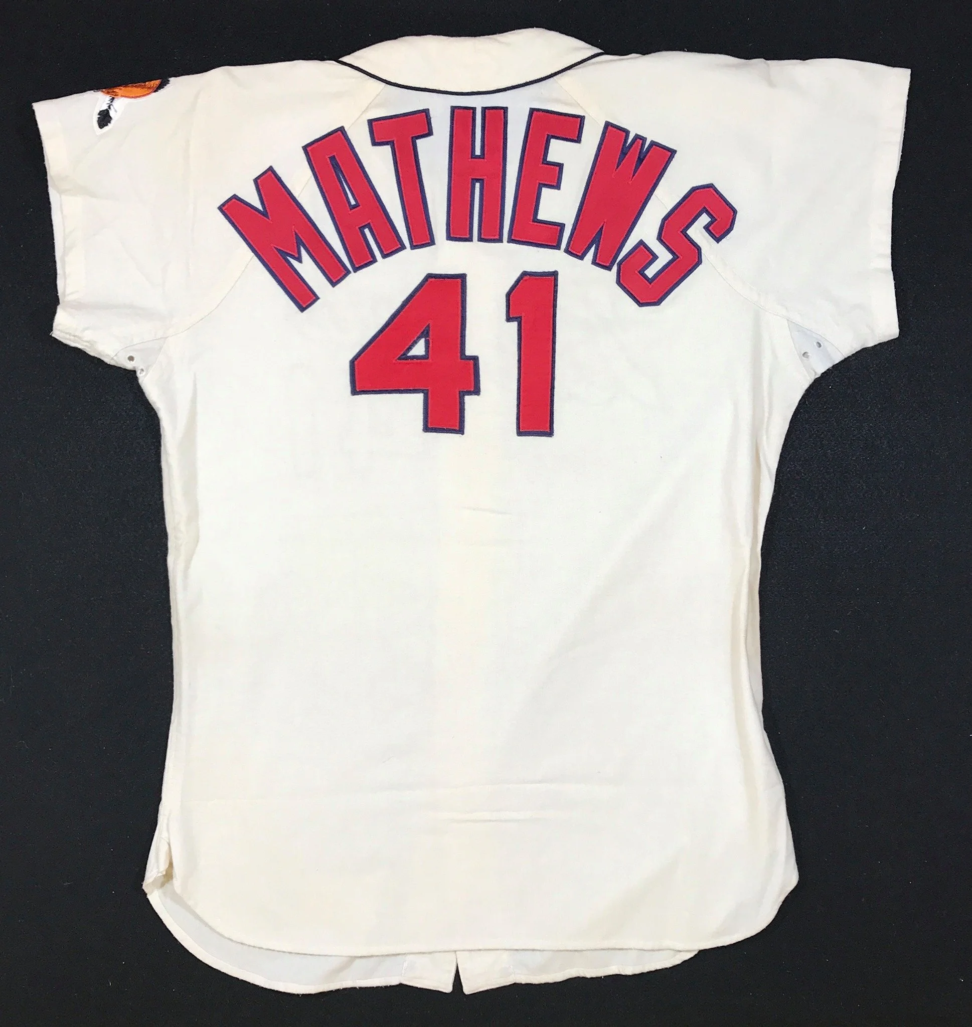
Here is the detail of the final product
How much does something like this cost? A restoration to this level of accuracy takes me more than a day to complete. Imaging what you might pay your lawyer, CPA, or bricklayer for a day and a half of his time and you’ll be in the right ballpark. And while I’ve been asked to invest this much time in valuable pieces like this one, you might be surprised the number of times I do it for items which have a high sentimental value to their owner, alone. And, on to the next project!