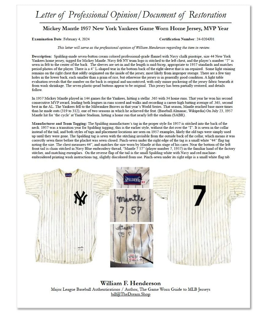
Restoration / Authentication
1957 Yankees Mickey Mantle
When a smiling armed guard with a gun strapped to his hip rings your doorbell to deliver a package and requires a signature, you know it's not going to be a normal day.
The jersey we have today to restore and authenticate happens to be Mickey Mantle's 1957 Yankees home jersey. That was an MVP year for him, a World Series year, and this jersey has been photo matched to him to his only game in his career where he hit for the cycle. It is here because it needs to be restored so it can go to auction.
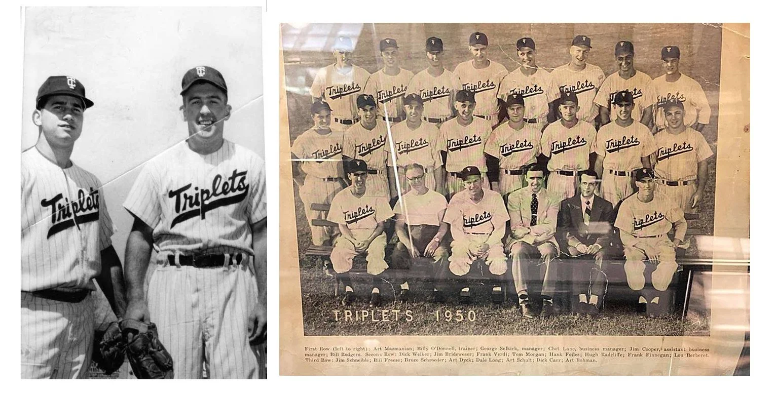
The first question I am usually asked when people learn that I am restoring baseball jerseys is, “Restored? Why? What is the matter with them?” It's hard for people to grasp the idea that a historic Yankees jersey from an iconic player in a record-breaking season would be anything other than coveted and well preserved. And that's just not the case. Like with nearly all Yankees jerseys through the early 1990s, this one was sent to the minor leagues after its use in New York was completed. The Yankees had a huge number of farm teams, and because none of them used the iconic "NY" on the front, all of the jerseys had to be stripped for reuse. That was the case with this one. It went to Binghamton where it was repurposed as a Binghamton Triplets jersey.

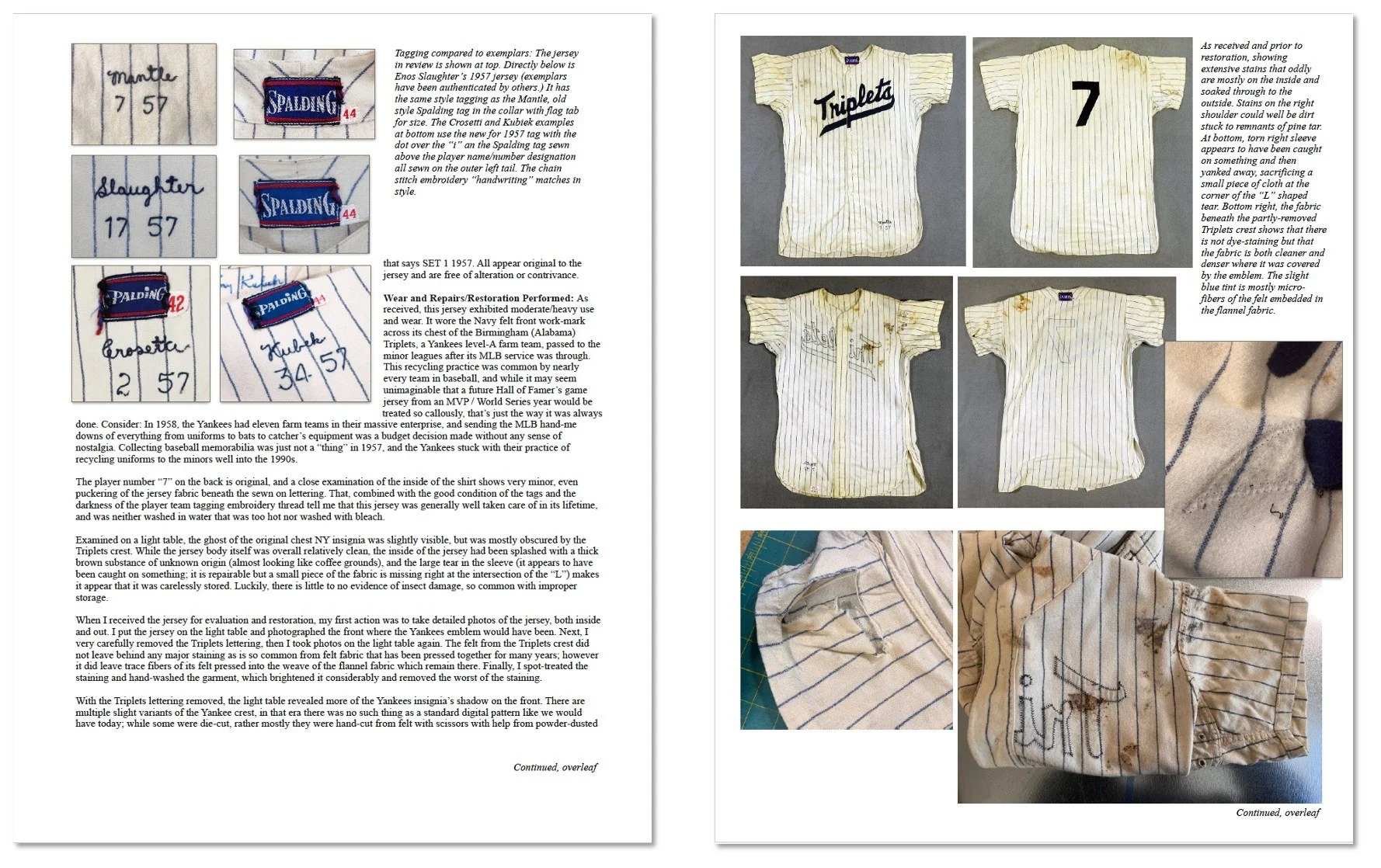
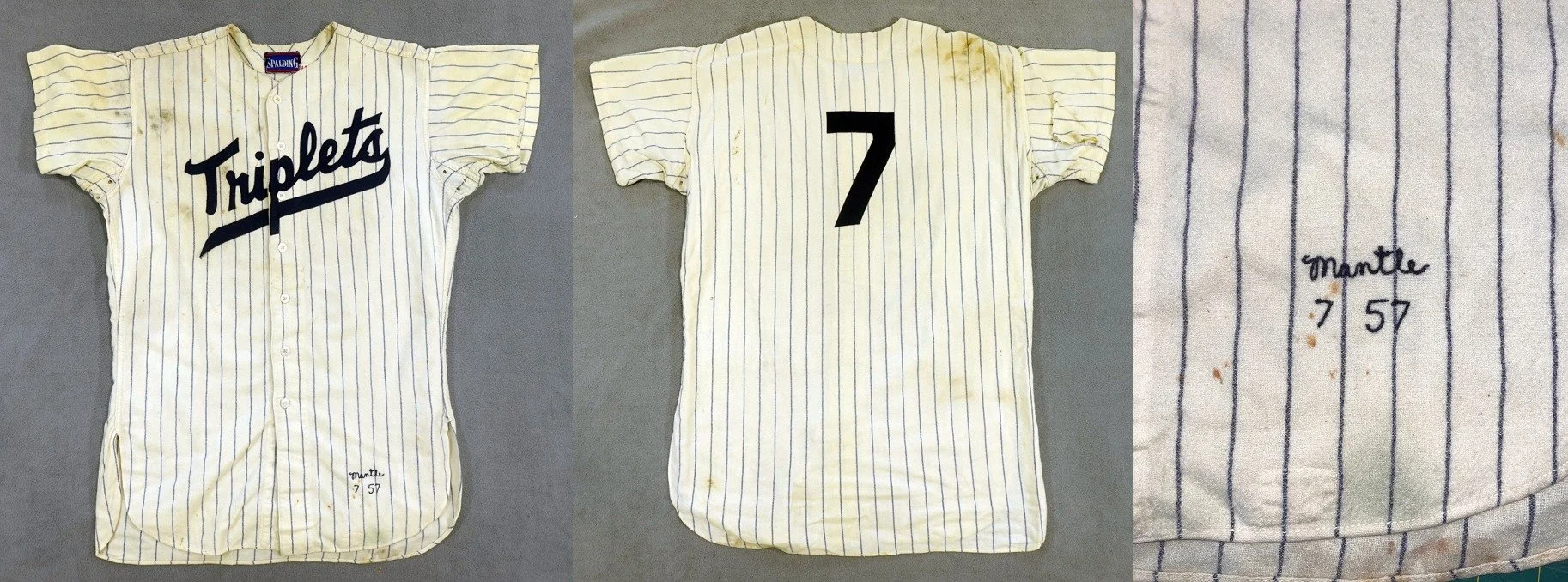
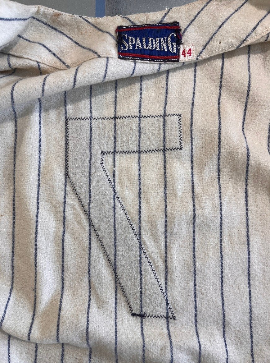
As received, the Triplets crest from the late 50s was still stitched to the front. Mantle’s number seven was on the back, and his name is embroidered in the tail, one can only imagine the thrill of the player to whom this jersey was issued in the minors, having a chance to wear it.
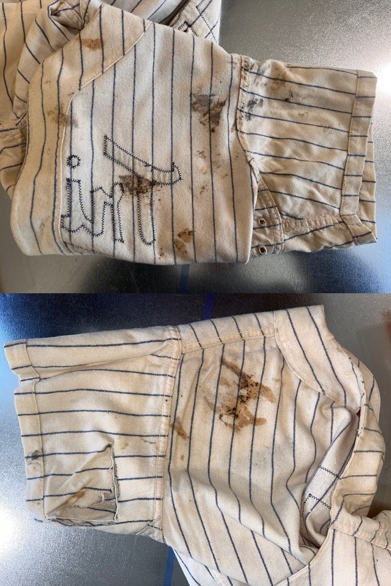
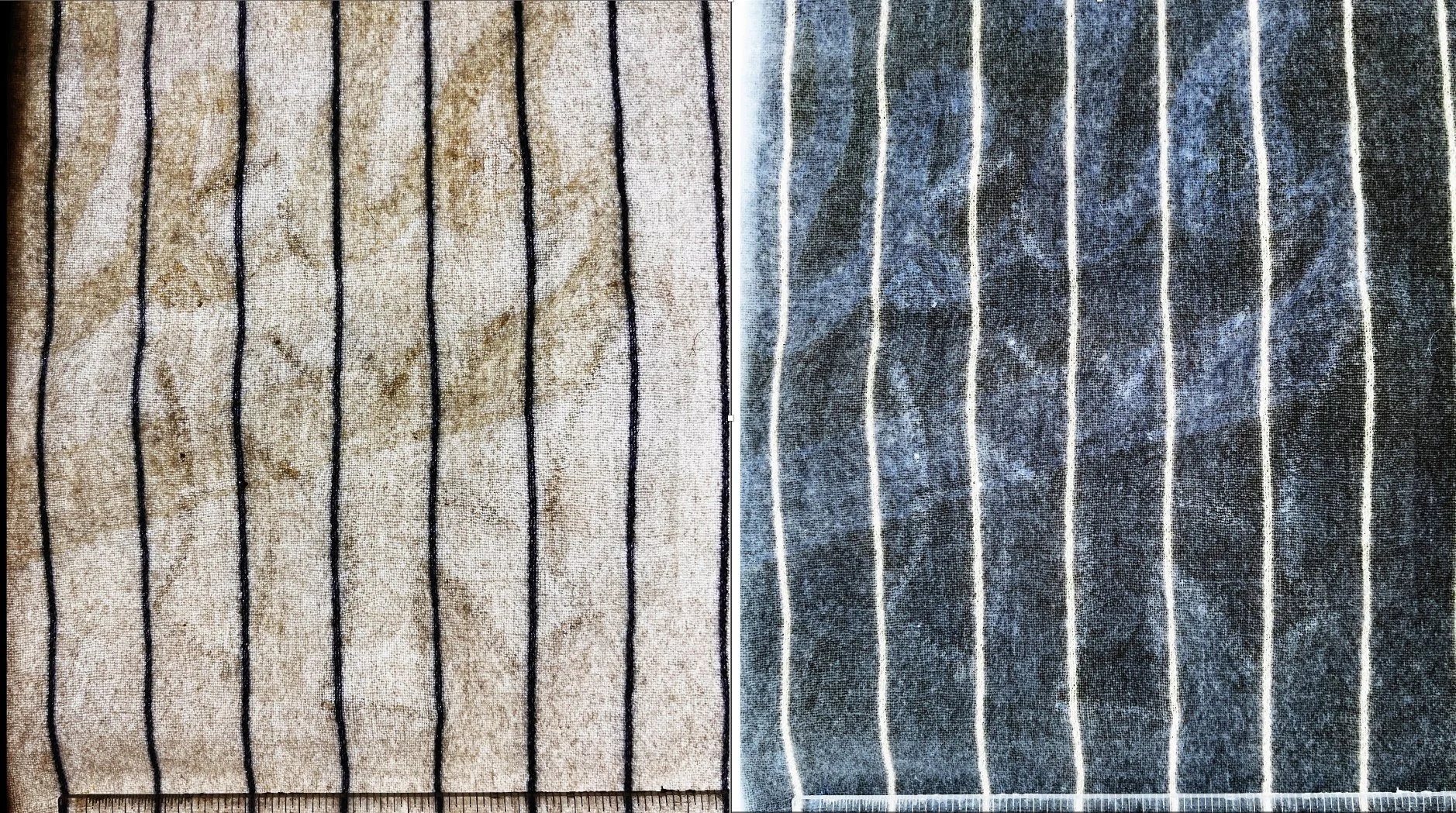
Looking at it more closely, we turn it inside out and find that it is absolutely filthy. It looks like coffee grounds and cat poop have been rubbed into it. There's a large L shape rip in the back of one of the sleeves. Looking at it, there's no sign that the Yankees crest was on the front, but I know if we some detective work we can find out more.
Putting it on the light table, we can see a few very faint marks where the Yankees New York crest had been on the front (more on that in a moment) but I also notice the signature puckering underneath the Triplets logo. That tells me it was washed many many times with that felt emblem stitched in place. Puckering happens when the fabrics shrink at different rates during hot water washing. The amount of puckering tells me that it was probably used for multiple seasons in Binghamton before it was retired.
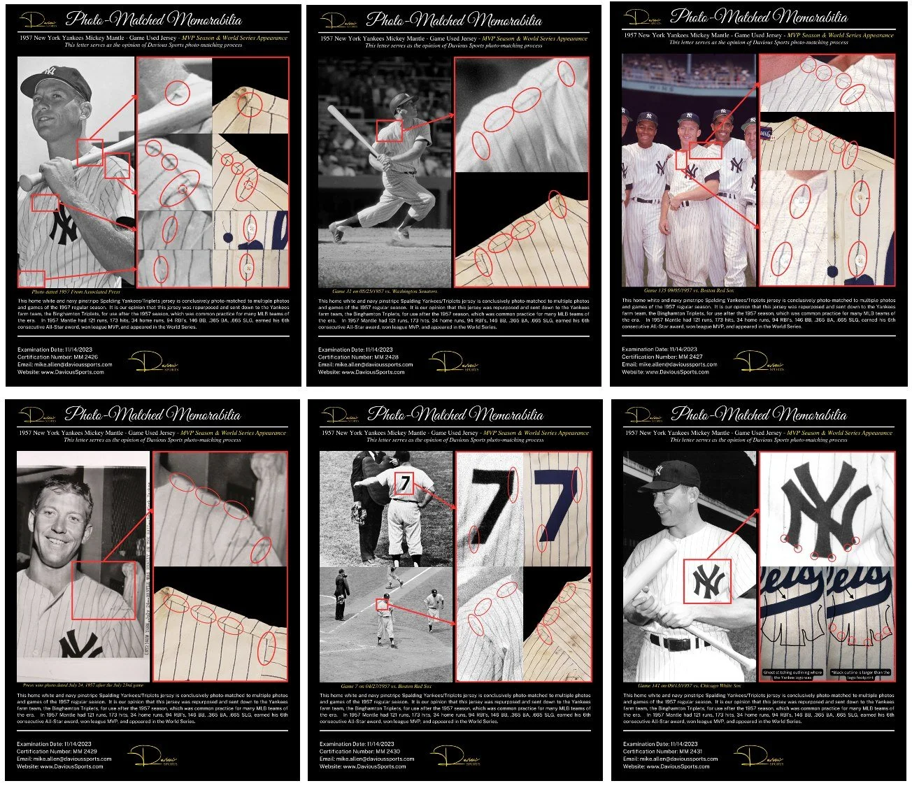
When it came to me, this jersey had already been photo matched. Yankees jerseys are easier than many to photomatch to game use for two reasons. First, the pinstripes help a great deal, we can see where they align at the seams, where the buttons are placed in relation to them, and where the emblems and numbers are stitched compared to the location of the stripes. And secondly, the shear number of photos of the Yankees that appeared in the media compared to other teams. The New York Press was all over them, and especially photos of Mantle were in the newspaper daily. Two different companies photo matched this jersey to over a dozen games including the game that Mantle hit for the cycle.
The light table shows that nothing has been changed on the back of this jersey, and the very fine and even puckering pattern of the flannel fabric beneath the felt number is impossible to reproduce. My conclusion is that the seven on the back is the original one and it is never been touched.
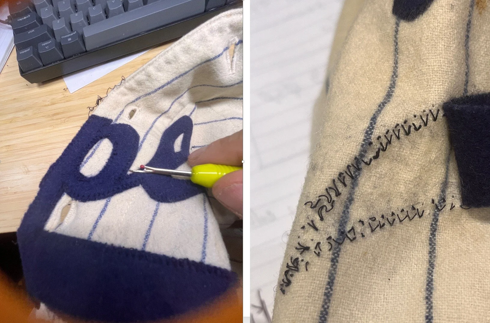
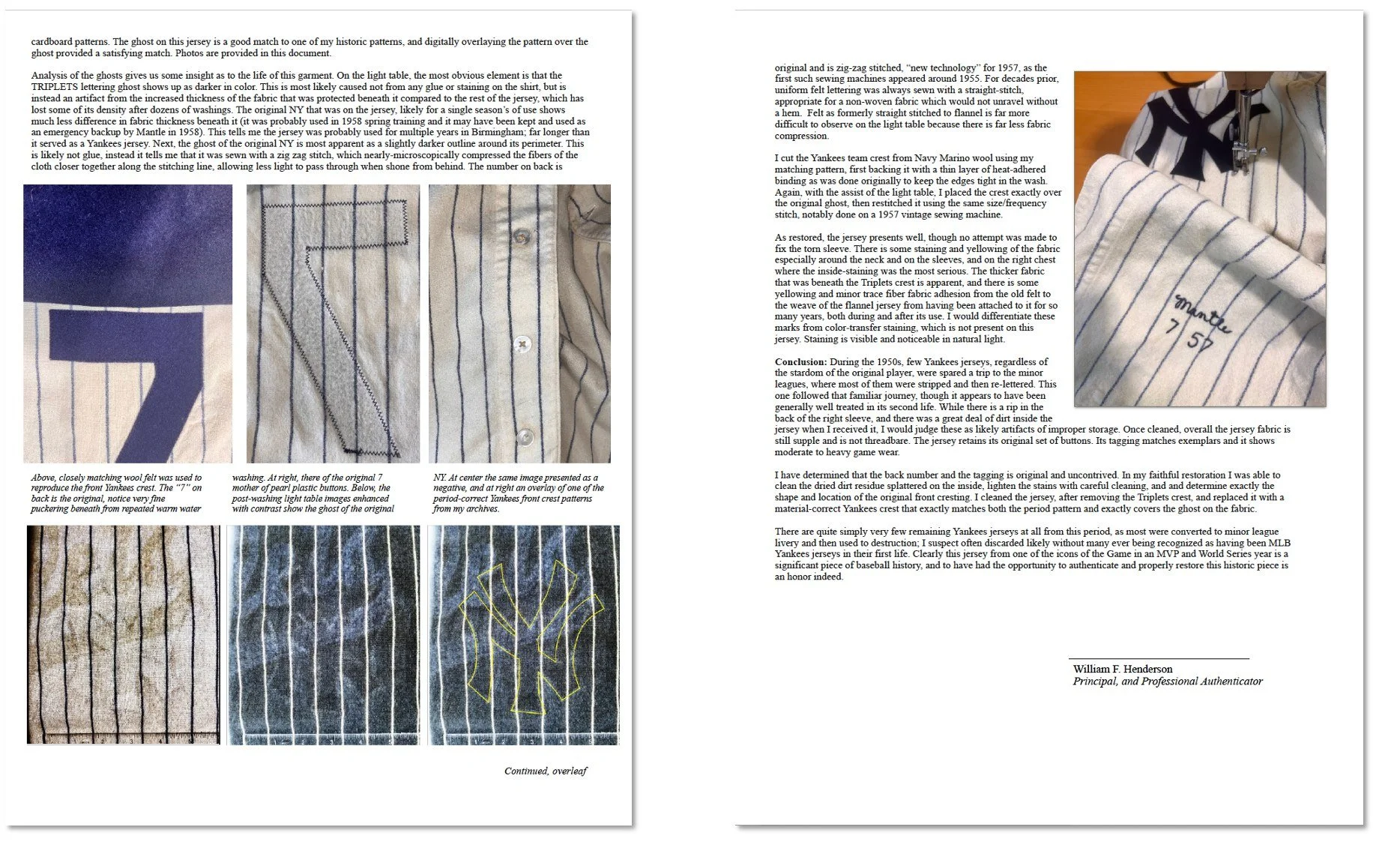
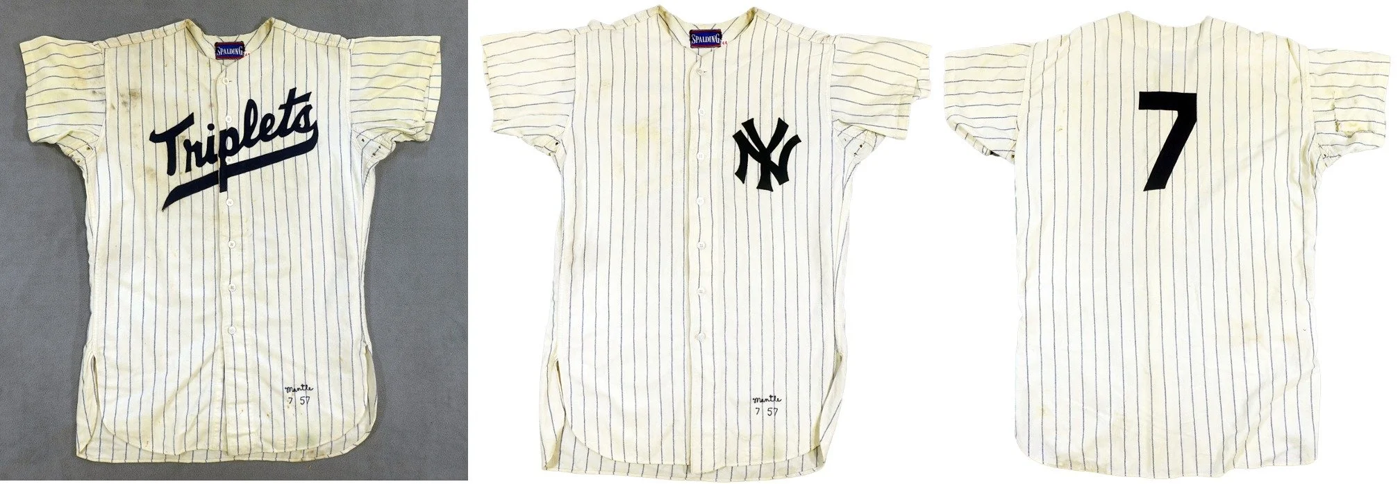
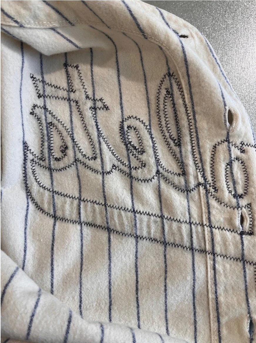
The first step is to carefully remove the Triplets crest from the front. This needs to be done with a magnifying glass, with a seam ripper, and done one stitch at a time. After the Triplets crest has been removed, we can get started with the light table. We want to look not just for evidence of the Yankees crest on the front, but also the exact placement of it. With any luck it will match the photo matching documents that have already been completed.
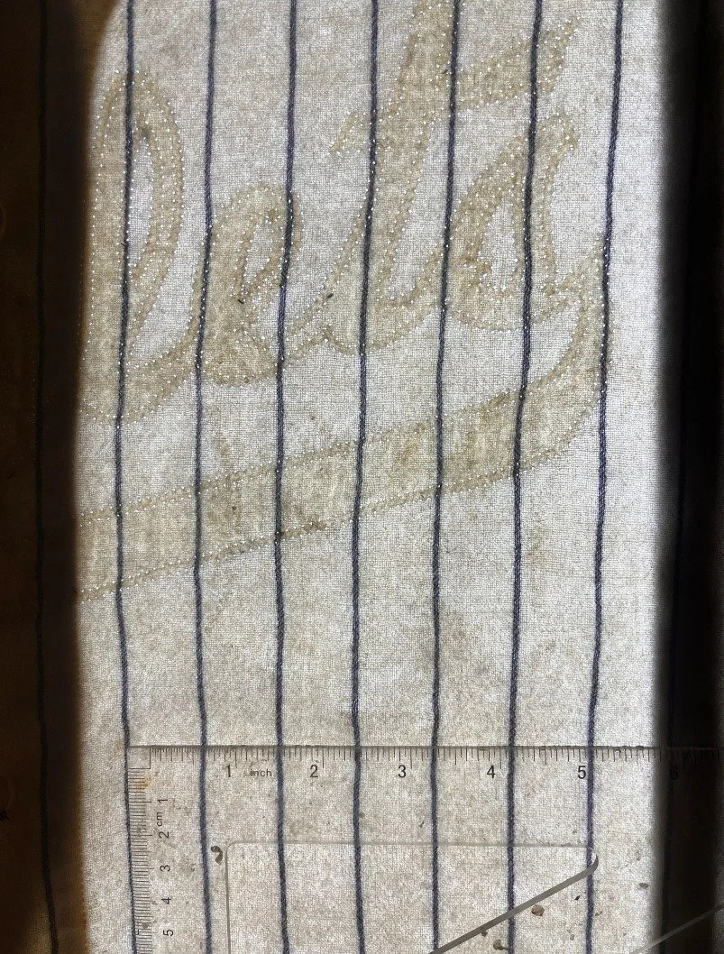
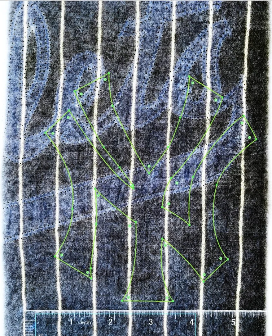
(shown here on the light table but without any photo enhancement) So why is the Triplets shadow so prominent? The reason is primarily because the fabric beneath it is thicker than the surrounding fabric. As this jersey was washed dozens of times with the Triplets crest on the front, that area was protected in the washing machine and stayed thicker. Now with it removed, it is harder for the light to pass through the place it had been sewn. Sometimes the darker area is because of the application of glue that held down the lettering. That is not the case here, once unstitched the Triplets logo came right off.
Using a combination of techniques which include using ultraviolet light, the light table and enhancing the image with all of the tools in Adobe Photoshop, we can now clearly see the outline of the Yankees emblem. If you look, you can also see the very clear darker outline of the Triplets emblem that was definitely on this shirt for longer than the Yankees NY was ever there. Legacy ghost imprints on fabric are generally caused by four things: 1) Glue and dye transfer from the old emblem. 2) Fabric compression around the outline edges caused by the sewing machine thread. 3) Noticeable difference in fabric thickness under what would have been the placement of the original emblem. (This occurs when that spot is protected from abrasion during machine-washing by the old emblem, so as the surrounding fabric is abraded it becomes marginally thinner/more threadbare, and allows light to pass through it more easily, the result is a darker area on the light table showing the location of the old emblem.) 4) Small holes caused by the removal of the old emblem. I especially look for holes at the spots where the old and new emblem’s lines may have intersected— these small spots are made especially weaker because they have been sewn over and had thread ripped out twice, making them more likely to produce a hole of some size. In this case, there are no holes surrounding the perimeter of the Yankees NY emblem. It must have been carefully removed, back then. So why are the outline-edges darker? This is an artifact of zigzag stitching. Zigzag stitching was only introduced on commercial sewing machines in the late 1950s, and prior to then, all felt lettering was straight-stitched. When straight stitching is removed it leaves almost no mark, especially if the jersey has been washed many times afterwards. But zigzag stitching compresses the fibers in the fabric very slightly along the stitching line, moving the fibers closer together with the tension of the thread in the machine. The fiber compression causes a dark line in those spots. Because the original seven on the back is still zigzag stitched, we can be confident that the Yankees emblem on the front of this jersey was also zigzag stitched as well. Thanks to this artifact, we can see exactly where the NY logo had been placed. And not surprisingly, it matches exactly the photo match documents from 1957.
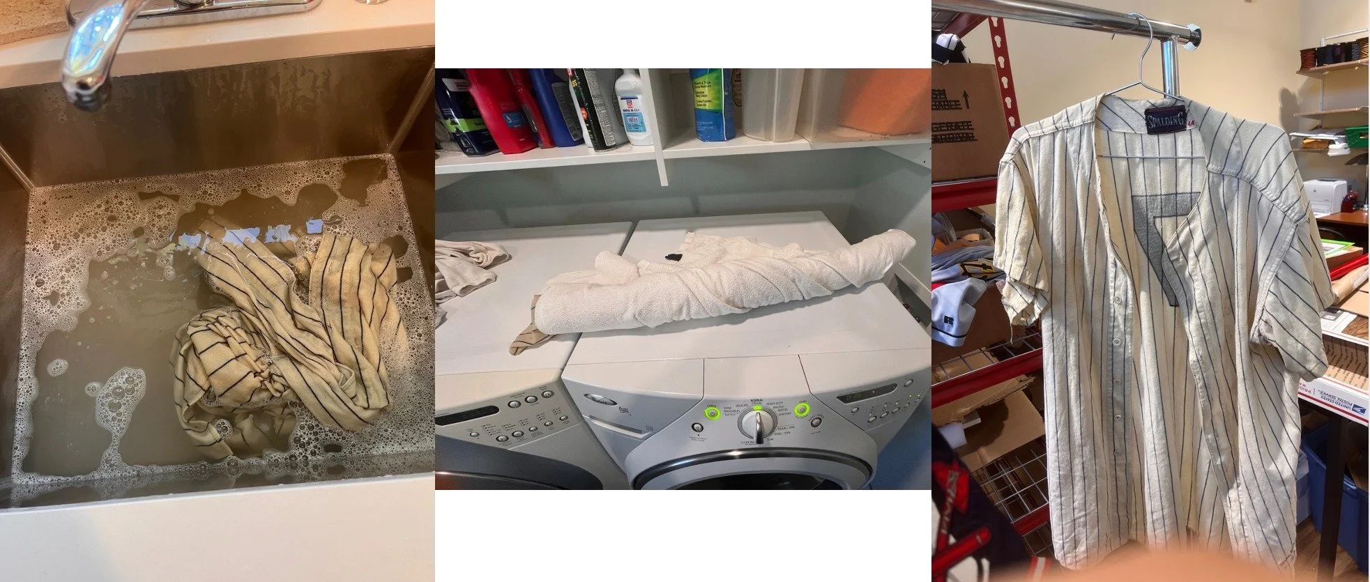
This forensic work done, we now move to the next step which can be something more than nerve-wracking. We have to wash this priceless garment. I take consolation in the fact that these fabrics were meant to be washed from the beginning, so we are not doing anything revolutionary here. A basin of warm water and a quarter cup of Woolite is where we begin. I gently rub the fabric against itself to try to loosen up all of the dirt that is inside. A couple of stubborn stains require a spray of Oxiclean which helps loosen them up and get them out of the shirt. After washing, I rinse the shirt four times with a basin of clean water to get all of the soap out of it. Once it drips dry into the sink, I roll it tightly in a cotton towel to wick all of the water out of it. We will not be wringing this jersey dry! After this step is completed it is barely damp. I then hang it to air dry.
Re-creating the Yankees crest on the front is not a quick and simple process. It involves several steps to make sure that we get it perfectly correct. Going back to 1957, there were no computers or laser cutters. Original team name crests were most commonly cut by hand from felt, the outline set with a powder-dusted vellum pattern. Closely spaced pinholes in the vellum paper allowed talcum powder to fall through and define the edge of the emblem onto a piece of wool felt that was usually backed with a thin layer gauze-like dressmaker’s interfacing to keep it from fraying. The emblem was then cut by hand using a pair of sharp scissors. I have a library of scans of original Yankees crests going back to the 1920s. Before I re-create anything, I look in my library to see what I have that is very close to the emblem on the shirt. In this case, one of my standard 1957 archival emblems matched almost exactly. It needed only a slight bit of tweaking, that was probably related to shrinkage of the fabric of the jersey to make it match. We want to make sure that the new emblem covers the old ghost as much as possible. I was asked whether or not it made sense to find another more common-player 1957 Yankees jersey at auction and steal the front emblem off of it to stitch it in place, using a vintage replacement rather than making a new one. I recommended against this for a couple of reasons. First of all most of the 1957 jerseys that are offered at auction have replacement front crests; they are not the original ones for the same reasons I mentioned before. And secondly it is very unlikely that even an original crest would fit the shrinkage pattern on this jersey exactly. We'd end up with some sort of a mismatch that would be visible on the light table. I have the original Marino wool that was used back in the day, and I recommended that my recreation would be a better solution, and the jersey owner agreed.
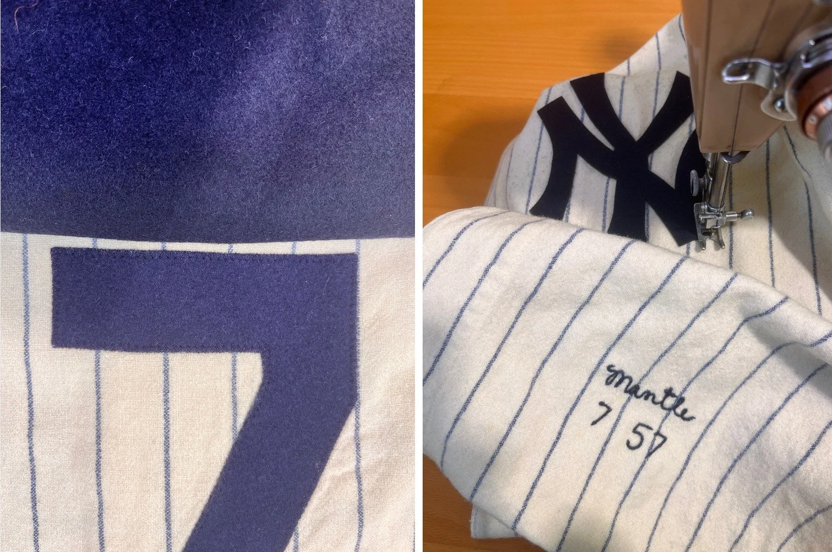
Newly cut from color-matching vintage wool felt, I stitched the emblem in place using a zigzag stitch that closely matched that of the back number 7, in size and frequency, on my 1957 Singer sewing machine. You don't get much more original than that!
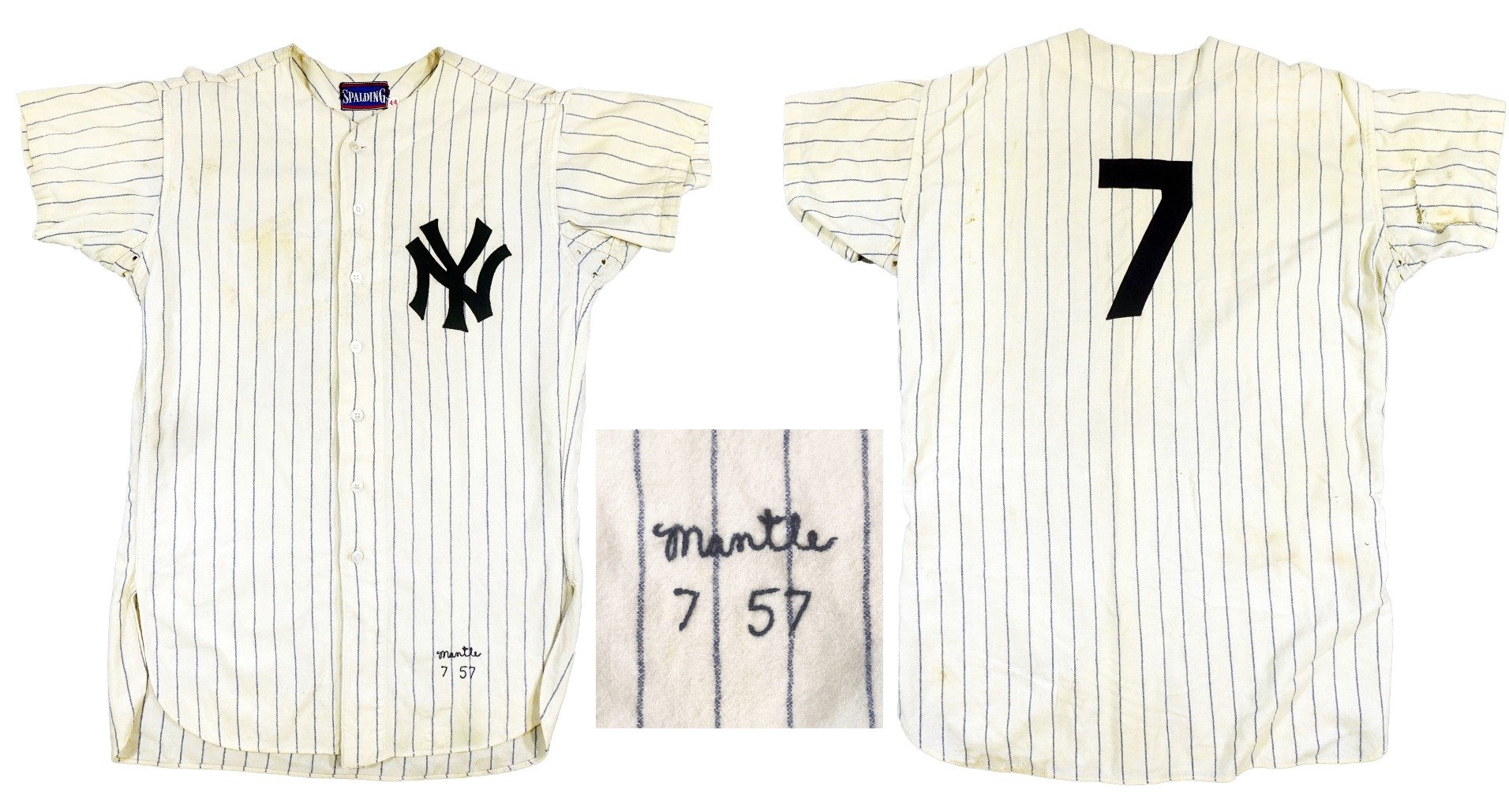
Here is the completed job– everything I’ve learned in my years doing this type of work goes into a conservation like this one. It has to be perfect. Is a piece of American history.
The final step is always a complete professional letter of opinion, documenting the restoration. I have included my evaluation here over the next copy of photos for you to read. This jersey goes up for auction this week at Goldin auctions, for those of you who may have just won the lottery, the opening bid is $200,000. Here is the link: https://goldin.co/item/1957-mickey-mantle-game-used-new-york-yankees-home-pinstripe-jersey-mvh6e15?queryId=eyJjYXJkSW5kZXgiOjl9 I enjoy working with the folks at Goldin very much: They respect my opinions, and they are incredibly committed to authentication, conservation, and preservation. When I finished this jersey a couple weeks ago, I received the nicest letter from its current owner thanking me for my work. This is why I do what I do, it makes me happy, and it makes other people happy. Now, on to the next project… maybe it is yours?